Brand Development
I was tasked to reimagine/develop the AirPR brand with many limitations. We had some older stakeholders that didn't like change, so I needed to develop things in ways that weren't far off from what they currently had, and had to justify every move.
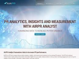
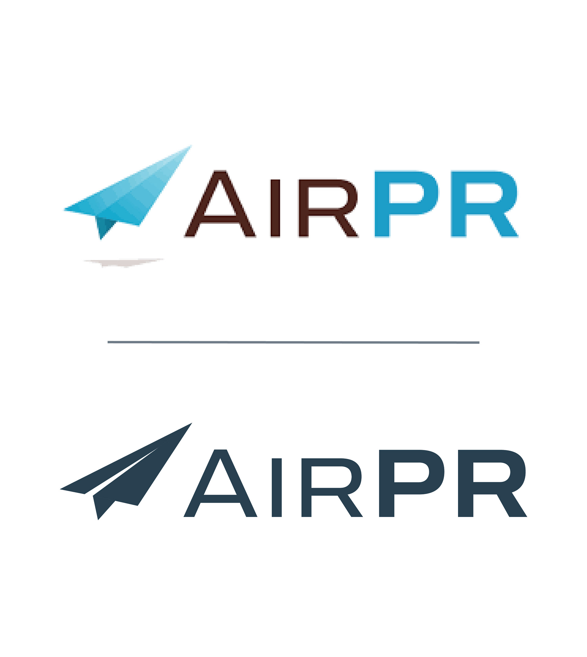
On my first day, the Marketing team provided me with this. AirPR had been working with d-level agencies and low-res images for years and knew they needed to step up their brand presence if they ever wanted to make waves in the space. However, some older stakeholders were very partial to the current look and didn't want to change much.
Step 1: Simplify
One major complaint that the team had was how difficult it was to make the logo look good on any print piece, swag item, screen, 1-pager, etc. We identified the main factor playing into that was the logo's complexity (shadow under the icon, gradient, etc). We also recognized that the brown color in "AIR" clashed with a lot of their work.
From my perspective, simplicity helps create good design. I worked diligently with the team to help simplify the logo, develop a color palette, and flatten the images.
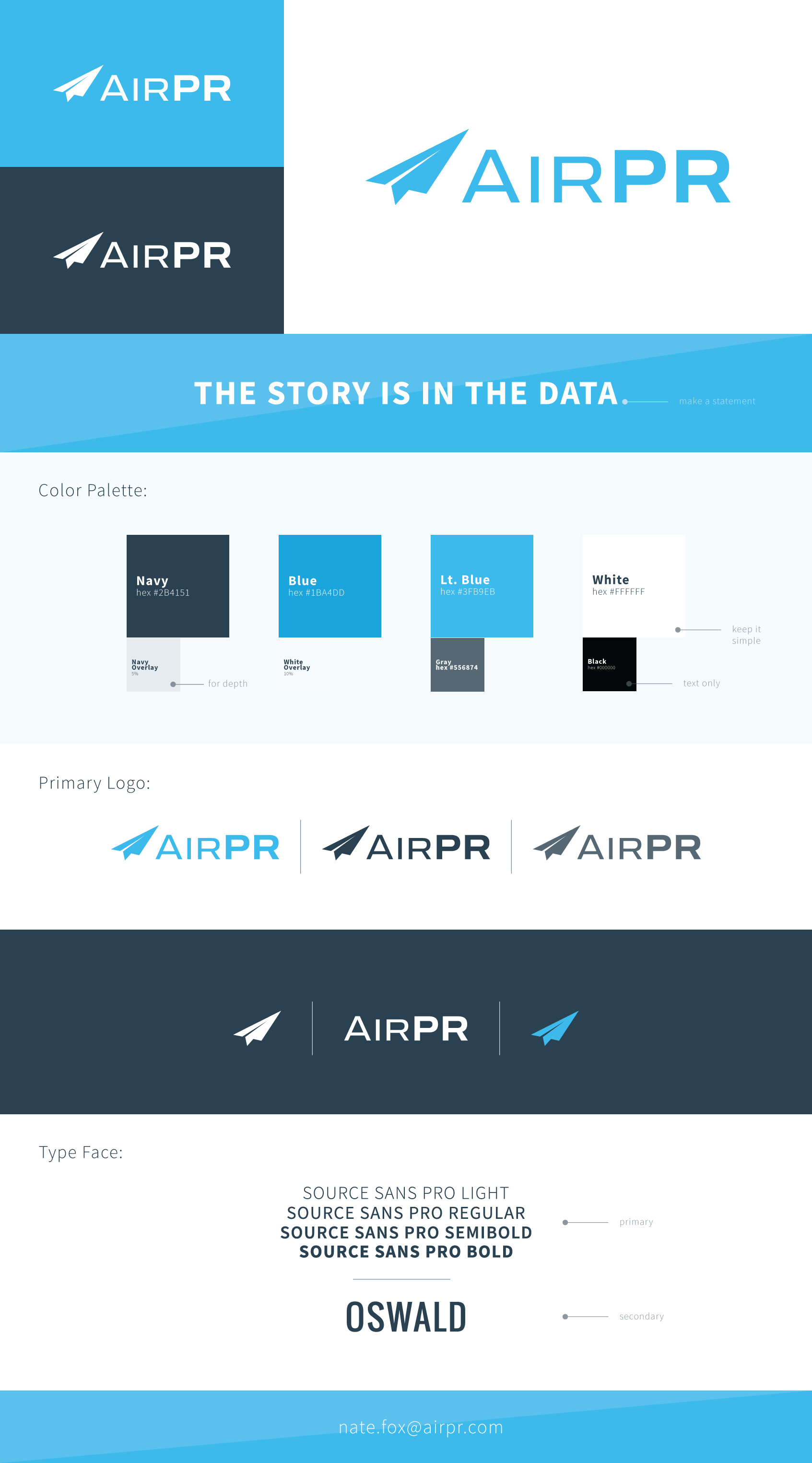
Step 2: Consistency
With executive leadership on board, I worked to develop a brand style guide. The team didn't recognize the importance of consistency across their marketing materials. Fonts were randomly selected, colors chosen on the season, and presentations were filled with inconsistent illustration styles.
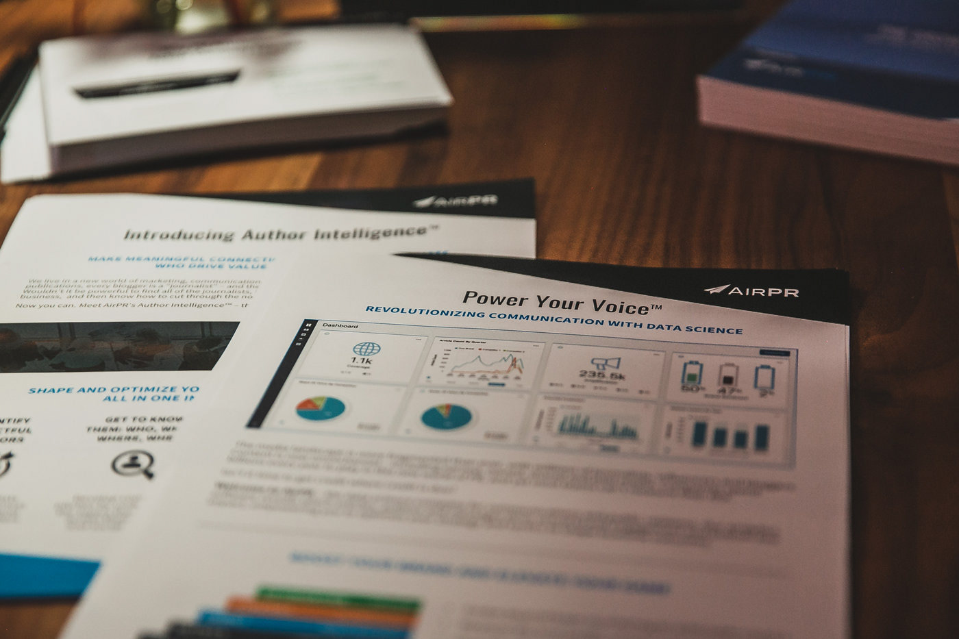
We started simple and created a baseline style guide. Every email, PowerPoint presentation, and ad began to fit within these guidelines. I worked with the UX team to help change design elements in our software UI.
Highlight: We did an email campaign with some high-level case study results in a banner image in this style. Typically the click rate of the emails was around 14%, but with the new images, we saw an 18 point increase.
Learnings: I would have worked to get more budget for this project. We had a small team and little to spend, but I should've pushed more and developed guidelines around voice and tone, photography, illustrations, etc.
Step 3: Execution
One of my favorite things about being a designer and creator is seeing what I create come to life. From digital/print ads to OOH and conference materials, seeing people respond and interact with a design is gratifying.
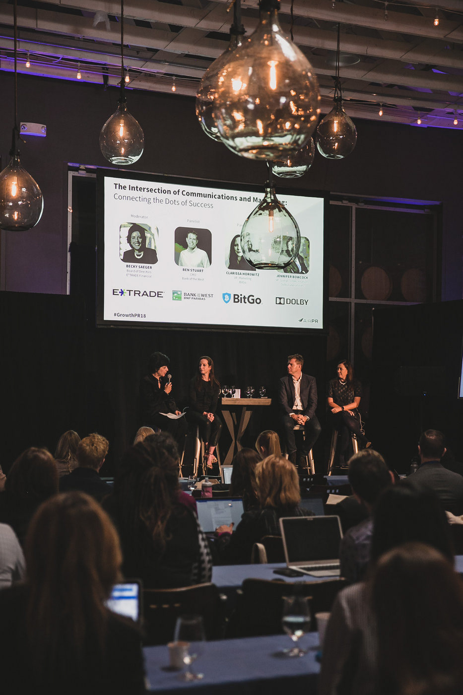
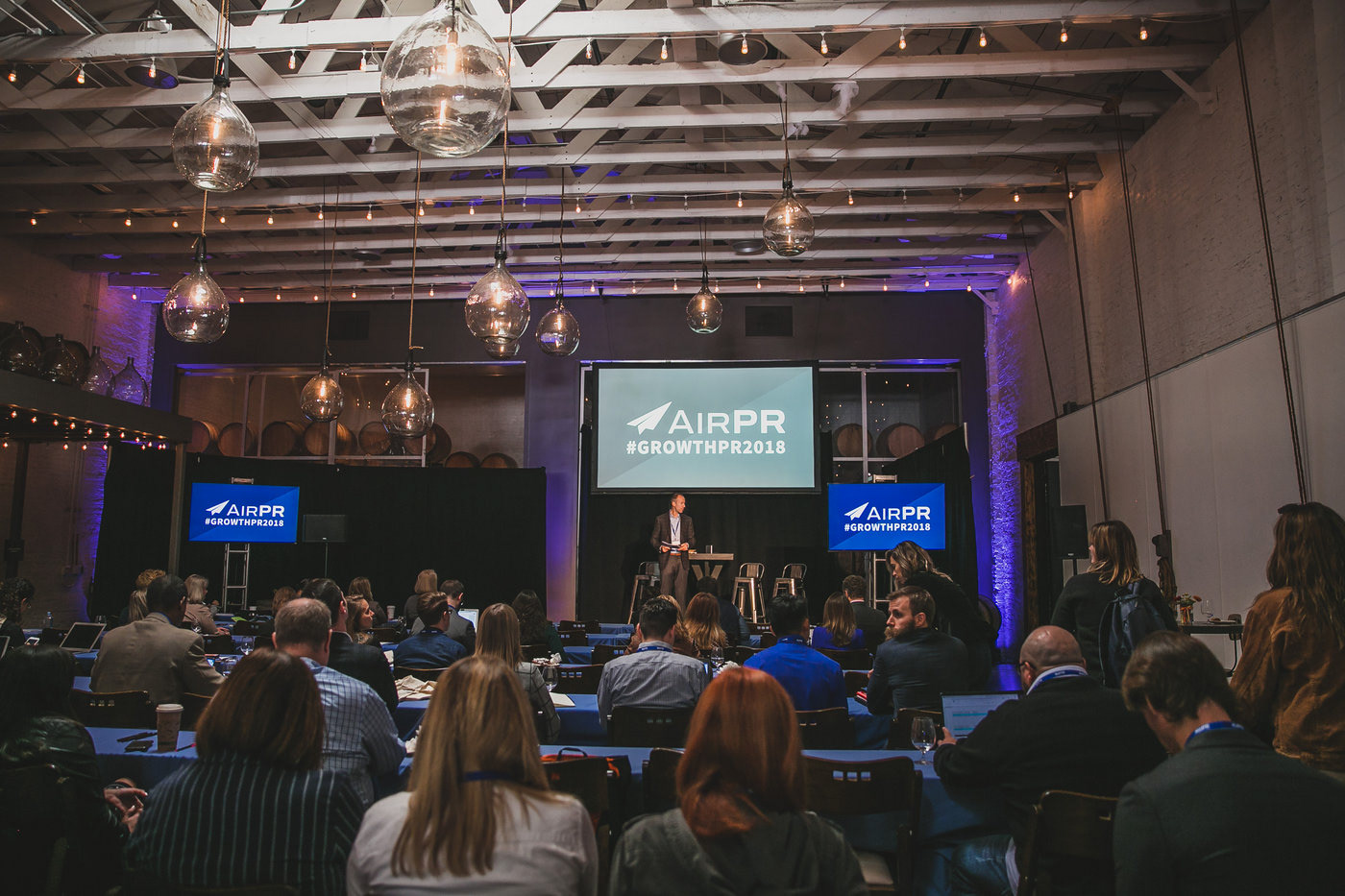
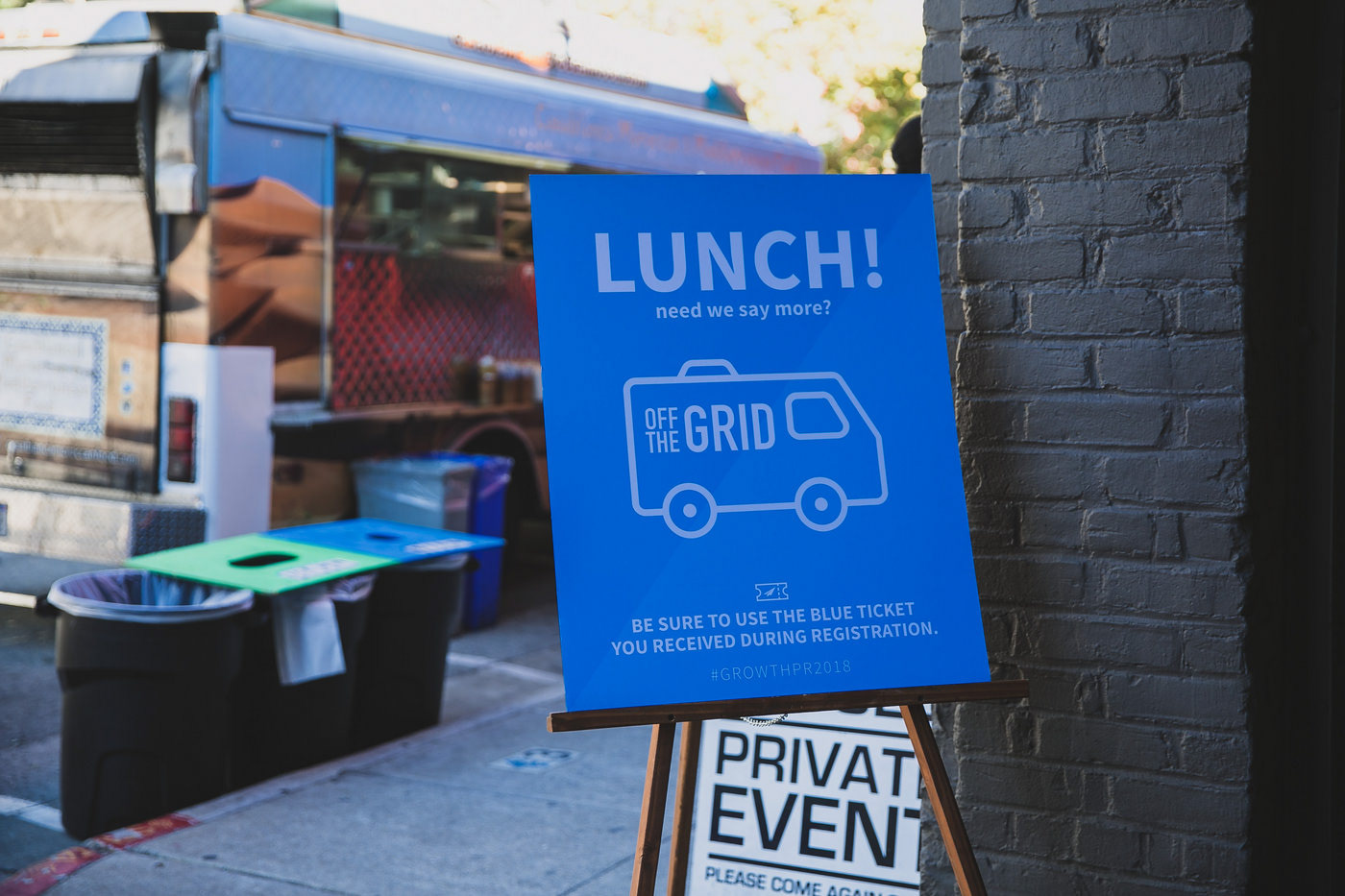
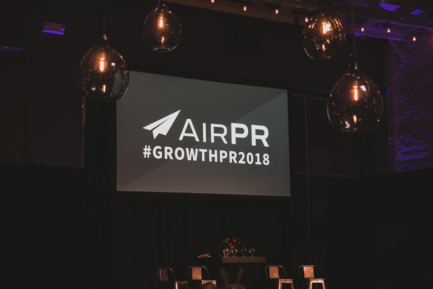
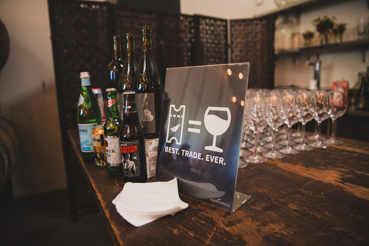
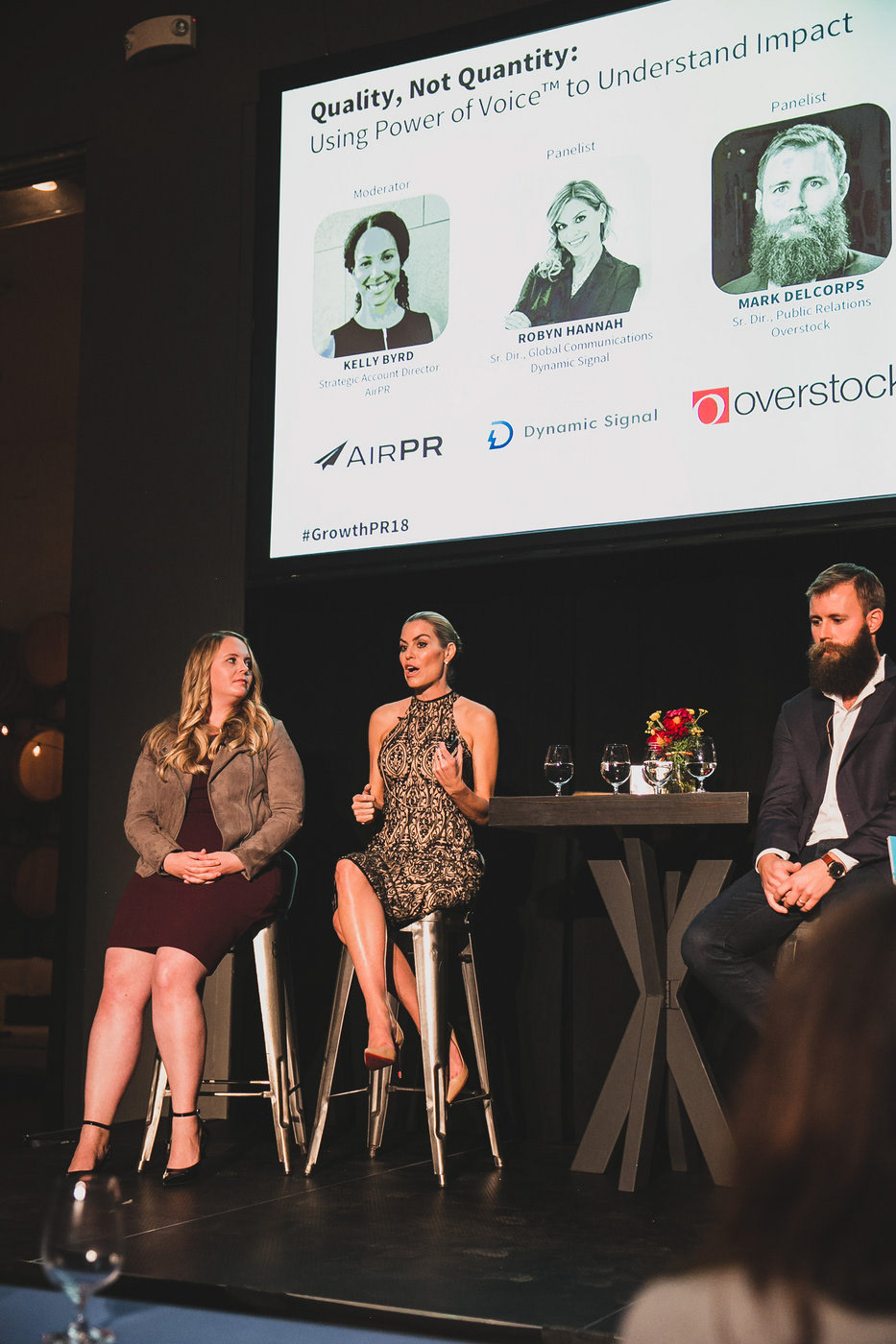
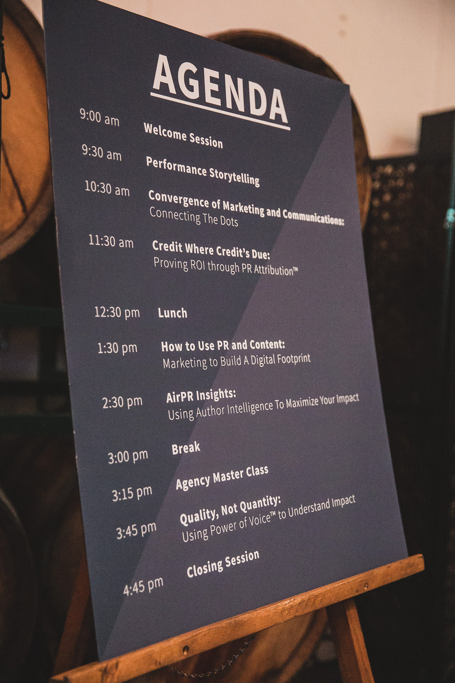
Something I'm proud of is seeing our hard work come to life at the annual AirPR conference. I was responsible for designing, ordering, printing, hosting, and project managing for this event.
This is just a taste of how we brought the new brand look and feel to life.
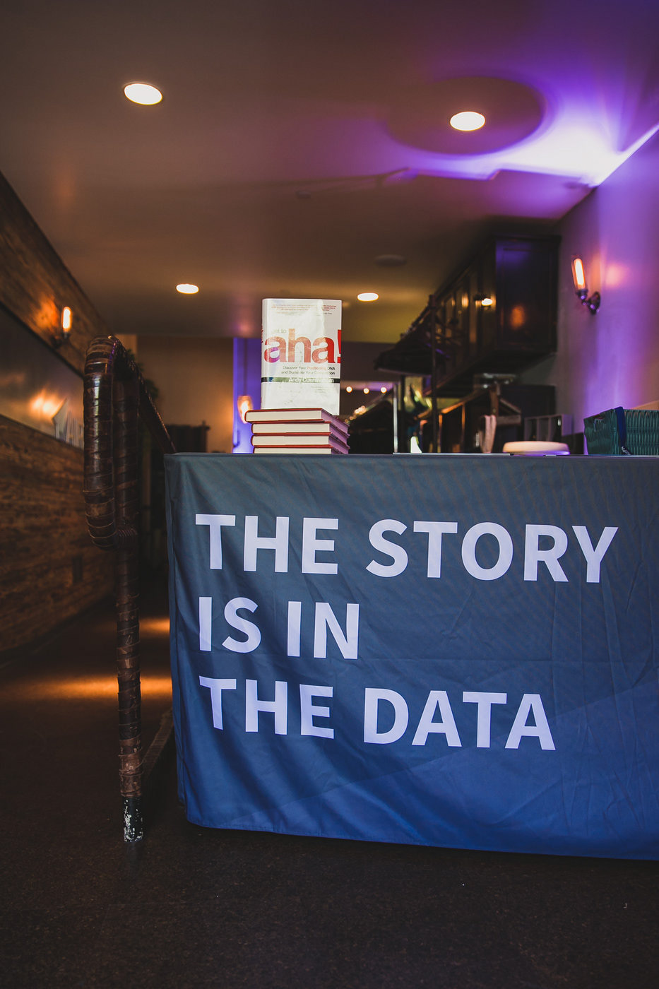
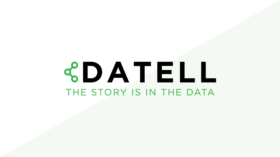
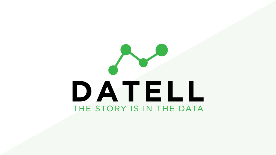
After some user research, we recognized that the name "AirPR" was misleading. Many assumed that we were a PR agency vs. a SaaS company — which kept us from many executive-level conversations at prospect companies.
Our tag line was "the story is in the data." I presented a new name, "Datell" (day-tell), and got support from all but two of our board of directors. This effort was started during my transition out of AirPR and dropped after I left. It turns out one opposing director had the rights and the URL to "Onclusive."
Though it felt like our hard work didn't pay off, I am grateful for the experience of helping a technology company go through the rebranding process.